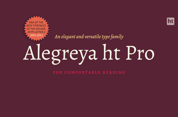
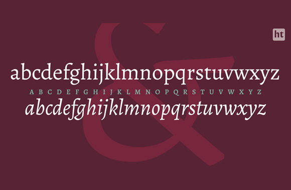
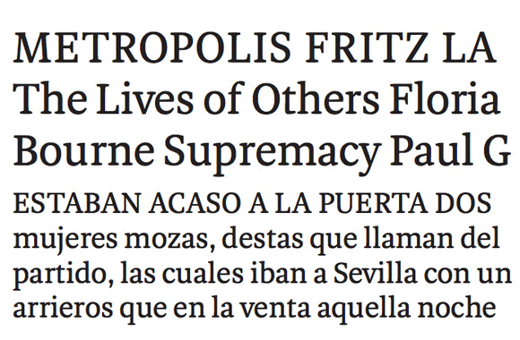
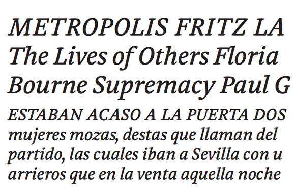
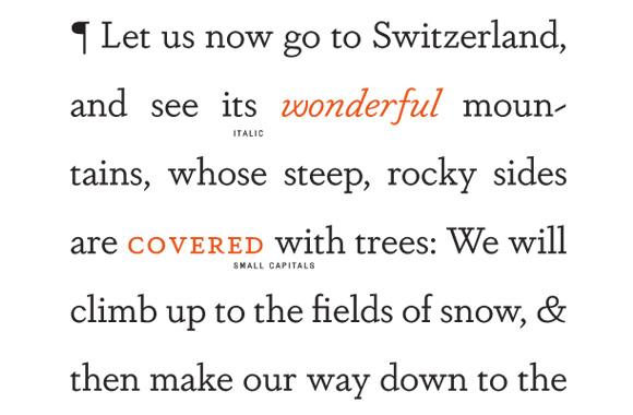
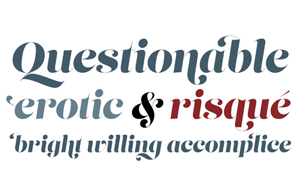
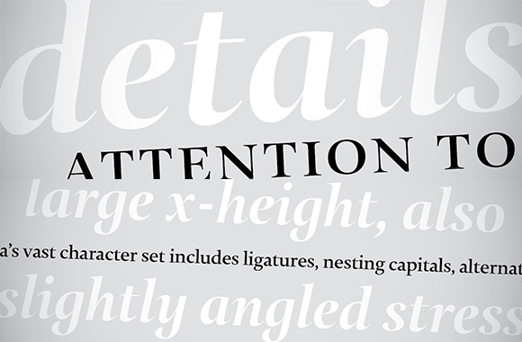
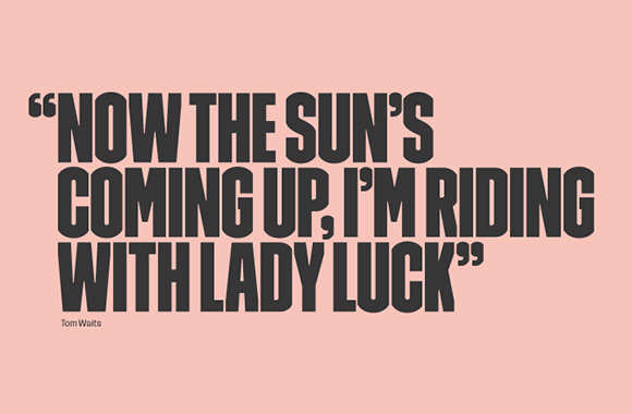
Alegreya Basic has been a Google Web font for some time. In 2012, the Argentinian type foundry Huerta Tipográfica released the Pro version. It is inspired by calligraphy and the letterforms have a heavy upper right stress. The elegant curves in the italics combine to create great rhythm. Alegreya’s balance makes it perfect for long texts. It was a Letter.2 winner amongst many other awards.
Designer: Juan Pablo del Peral

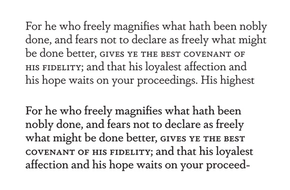
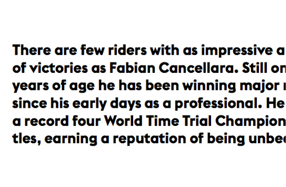
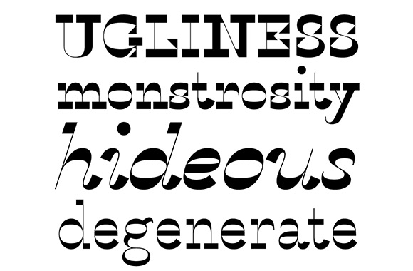
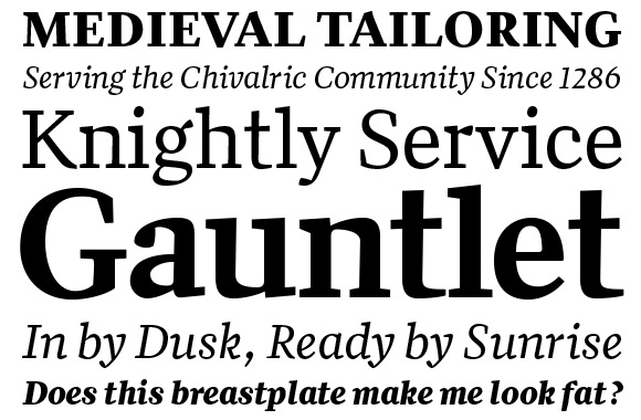
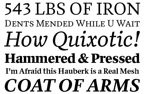
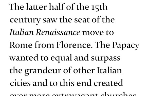
Anton Koovit is doing some wild things at Fatype, the new independent foundry he started with Yassin Baggar. Aleksei is a product of that wildness. He was inspired by circular movements. He expressed this in details like rotated ink drops and contrast. A lot of care was taken to balance the weight and balance the strokes (look at tapered serifs on the bold italic). Aleksei’s balance is most beautiful in long reading texts. It is a seemingly ordinary serif that feels contemporary. All the details have been finessed to work well at small sizes.
Designer: Anton Koovit
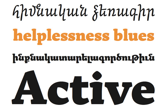
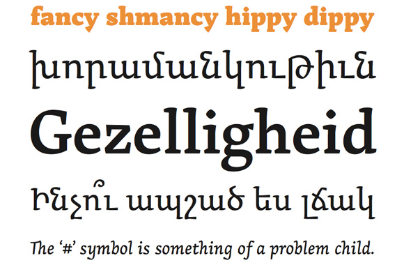
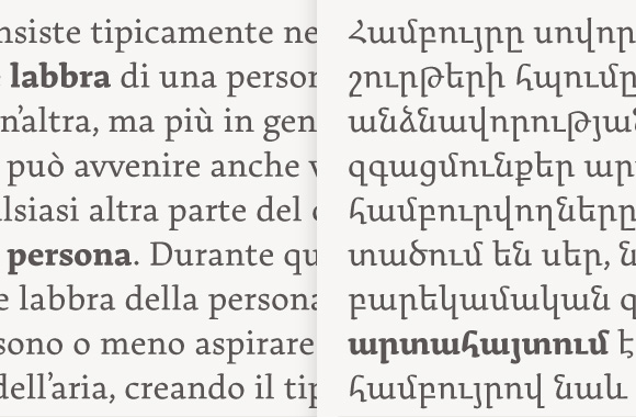
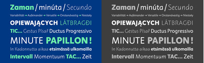
Arek was originally created for Latin and Armenian school books. Through extensive research of traditional Armenian manuscripts, the designer Khajag Apelian created the first Armenian cursive typeface. You can see strong calligraphic connections in the regular and italic strokes. The detail curves, loops, emphasized axis, and low contrast make it sturdy yet fun. Arek received the Gransan and Letter2 awards.
Designer: Khajag Apelian
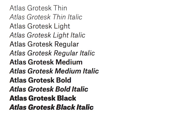
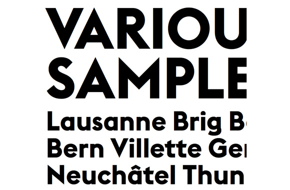
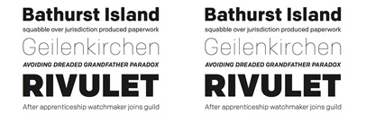
Atlas Grotesk was created when the German based reinsurance company Munich Re Group decided to replace their corporate typeface Univers. Commercial Type decided to ignore trends in corporate type design and turned to Dutch Modernism. They were inspired by the 50s Dutch san serif Mercator designed by Dick Dooijes and G. W. Ovink for the Amsterdam Type Foundry. Unlike Mercator, the contrast in Atlas Grotesk has more in common with American Gothics. We especially liked how Atlas looked when set at a small size. There’s enough optical space vertically and horizontally for perfect for reading. Great work by Kai Bernau and Susana Carvalho in collaboration with Christian Schwartz. Head over to Typemedia to see it in action!
Designers: Kai Bernau, Susana Carvalho, and Christian Schwartz
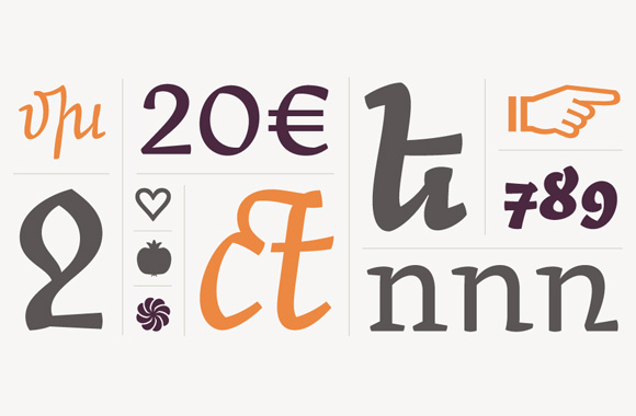
Combining an old style serif with a modern slab serif may not be an original idea, but Dapifer certainly is the first to do it well. Old style elements like sheer angled italics combine nicely with properly weighted slabs. The real fun starts in the alternate characters. We were intrigued by the canted ‘S’ in comparison to the evenly weighted alternate. The capital ‘U’ also came in symmetrical and inscriptional forms. Overall, it’s a very well drawn typeface with a whole box of surprises. Dapifer comes in 18 styles including a stencil style. Great work from the Darden Studio.
Designer: Joshua Darden
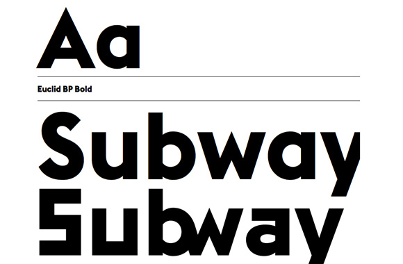
There are a lot of geometric sans serifs out there, but few good ones. Euclid BP is probably one of the best in this category. Emmanuel Rey’s greatest achievement is how contemporary he made these fundamental shapes. It pushes the potential of geometric letterforms to great length and utilizes all the latest OpenType features. It includes more than 500 additional alternates, pixel & semi pixel alternates (bit map font styles), one-line alternates and cut alternates. Did we mention the ligatures too? This is a graphic designers’ favorite for sure.
Designer: Emmanuel Rey
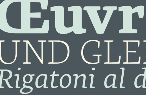
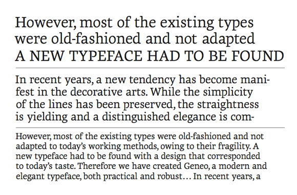
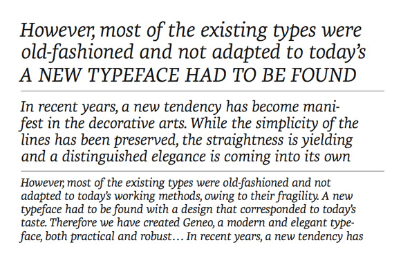
Stéphane Elbaz first designed Geneo in 2008. Last year, Typofonderie commissioned Elbaz to complete the typeface resulting in the foundry’s first collaboration with an outside designer. The aesthetic is a unique construction of classic and modern slab serif details. The connection between stem and serifs are curved instead of bent (see b, d, h, i, j, k, l, m, n, p, r, and u). The counters are also partly opened (see d, p, alternate a or g). These combined details give Geneo a contemporary feel. The family has nine weights making it a versatile font with a range of applications from reading to display. Geneo won the TDC2 in 2009.
Designer: Stéphane Elbaz
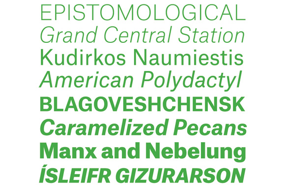
Some said 2012 was the ‘year of Grotesques.’ Some thought that they all looked alike, but they are each different. Amongst all these fonts Gira Sans stood out. Designed by Rui Abreu, it was inspired by early san serifs of the 19th century. Abreu reinterpreted them for today. We were particularly drawn to the italics and found them to be quite pleasant. The combination of clumsiness and cleanliness made for a very friendly font.
Designer: Rui Abreu
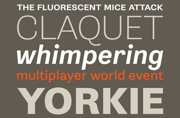
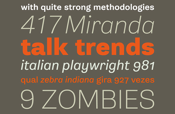
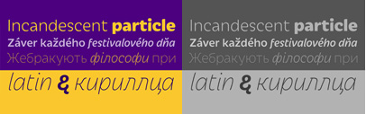
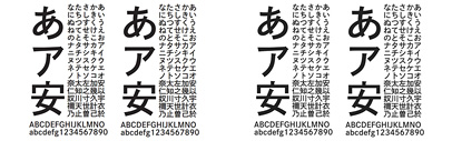
Greta Sans, a sans serif compagnon to Greta, is a collection of over 80 fonts that includes 10 weights, and four widths. As a result, it creates a variety of options to choose from for any application. The 13 original designs were so well made that details aren’t lost even in the extreme weights. The font remains flexible. We are excited to see how Greta will be adapted for non-latin typefaces. Japanese, with it complex character systems, will definitely be a unique challenge. Enjoy playing with Greta through Typotheque’s fun website.
Designer: Peter Biľak with Nikola Djurek
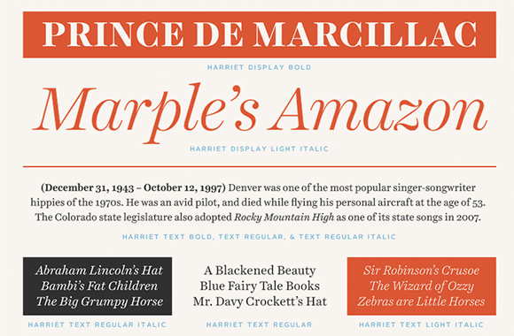
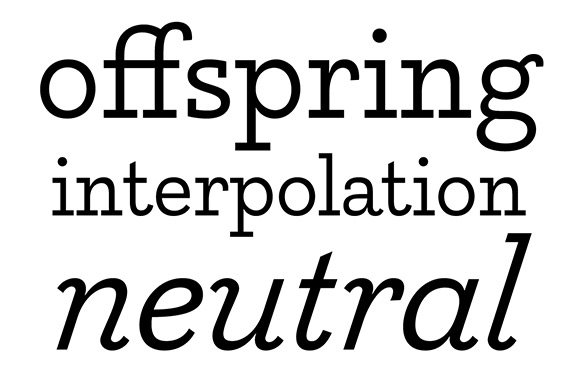
The Harriet Series, by Okay Type, wasn’t influenced by a specific historical typeface. Rather, it takes notes from both transitional and modern typefaces. The family consists of four flawless text weights and six display weights that range from thin to black. We especially loved the display hairline for its exquisite sharp serifs and ball terminals. Head to theharrietseries.com to enjoy a playful interactive demonstration of the whole Harriet family. The Series was awarded a Certificate of Type Design Awesomeness from TDC.
Designer: Jackson Cavanaugh
Karloff is the pairing of the Beauty and the Beast. In typographic history Didone, considered by many to be “the most beautiful in existence”; making it the Beauty. The exact Beast is debatable but a reversed-contrast ‘Italian’ has been a pretty sure bet. Typotheque set out to marry the two and created a shockingly harmonious family of three members (positive, negative, and neutral). At first, we weren’t convinced that they worked together but strangely we…can’t…look…away…
Conceived by Peter Biľak, designed by Pieter van Rosmalen, with assistance of Nikola Djurek.
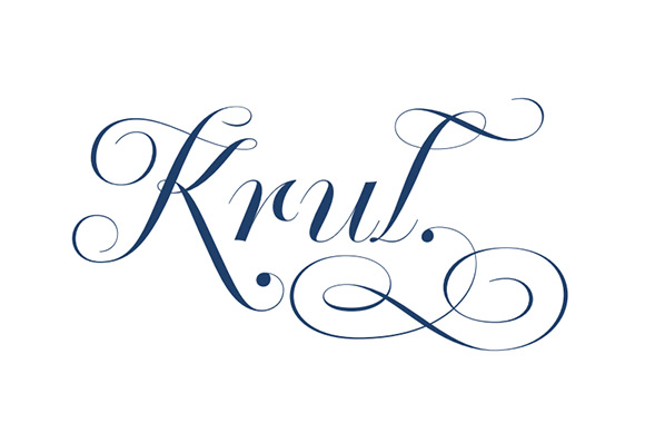
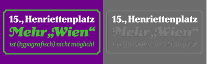
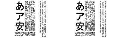
All around Amsterdam you will find wispy hand painted signs. You’ll find them in shop windows, on restaurant plates, and underneath your pint at the pub. This hand lettering is called “Amsterdamse Krulleter” (Amsterdam’s curly letter) and it was drawn by Dutch letter painter, Jan Willem Joseph Visser in the 40s. Krul was inspired by Visser’s legacy. Not only is this a digitization, but alternate characters and missing letters were added. The designer Ramiro Espionza was able to do this through in-depth research of Visser’s letters and work. Now Visser’s beautiful letters are truly timeless.
Designer: Ramiro Espinoza
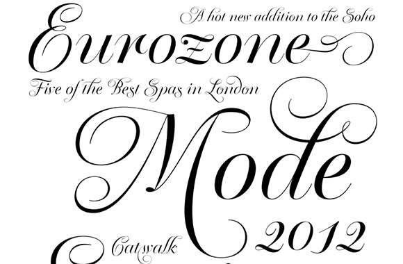
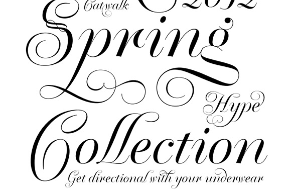
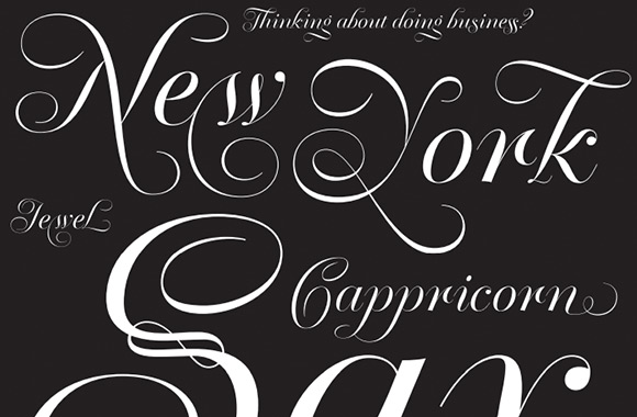
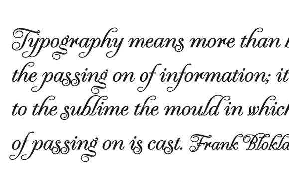
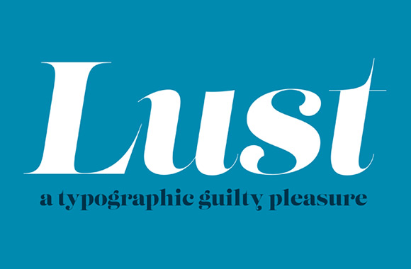
Lust comes in two different styles that share the same structure — the regular (Scotch Modern) and Didone. Both come with italic and display weights. This serif is a high contrast expression of sensuality. The thin hairline serifs elegantly disappear off of the thick stems. It’s a sheer delight to look at and the curvy serifs in the ball terminals are just pure fun. The family comes with a range of swashes that designers can play with for days.
Designer: Neil Summerour
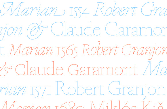
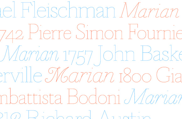
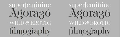
Marian is based off of classics: Garamond, Granjon, van den Keere, Kiš, Fleischmann, Fournier, Baskerville, Bodoni, and Austin. If that list sounds long, it is. Marian is a historical restyling of these exemplary typefaces from the mid-sixteenth century to the early nineteenth century. With thin and careful monolines the core structure of the original typefaces are revealed. The result is a refreshing take on the classics. Paul Barnes also included a blackletter weight as a “hidden track”. It was based on the work of 16th century Flemish type founder Hendrik van den Keere. Overall, this is a brilliant idea executed with perfection. This list is not ranked, but Marian sits pretty high up on the list in our hearts.
Designer: Paul Barnes
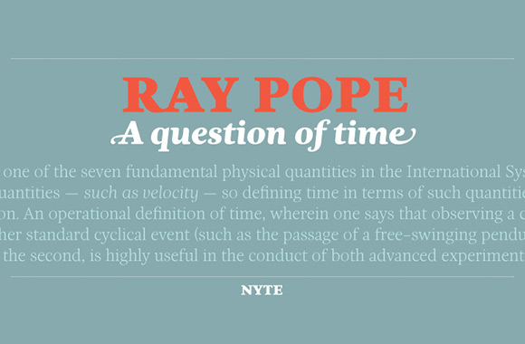
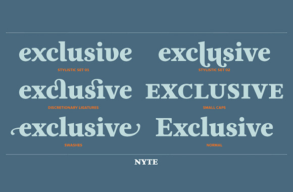
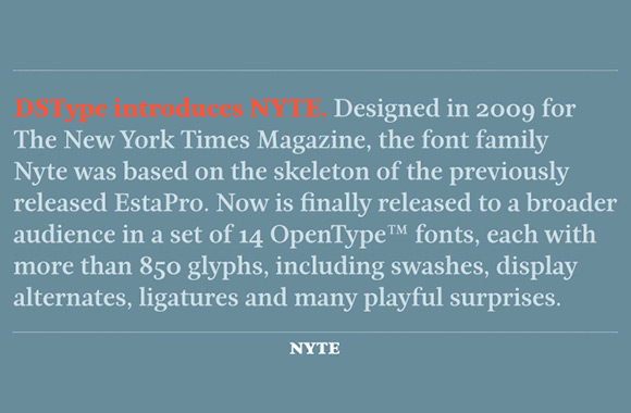
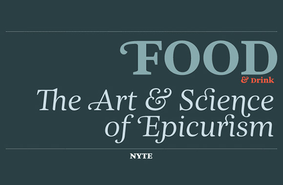
Nyte, a typeface used in the NY Times Magazine, was released for retail in 2012. The structure is based off of Etsa Pro. It has a warm texture, which is created by hand-writing effects and rounded forms. You can really see this in the careful letter spacing and joints. Nyte comes in seven weights from thin to black. The family includes lots of alternates, ligatures, and swatches. Overall this is a true and tried workhorse font.
Designer: Dino dos Santos
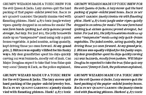
Quiosco can be found gracing the pages of Sports Illustrated, The Hollywood Reporter, and the Wisconsin State Journal. Cyrus Highsmith’s creation became commercially available through Font Bureau’s Readability Series; a collection of typefaces optimized for use in printed newspapers. Highsmith utilized techniques he learned while creating type for newspaper text. Specifically, he utilizes contradictory shapes in the counters and outer space, a trick he also used in Prensa. In comparison to Prensa, Quiosco is more refined in its compactness and legibility. It’s a sturdy smooth reader.
Designer: Cyrus Highsmith
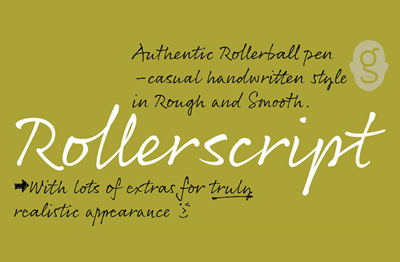
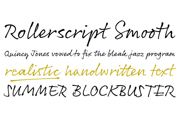
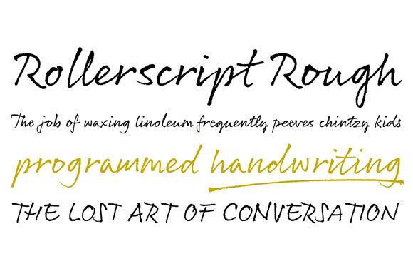
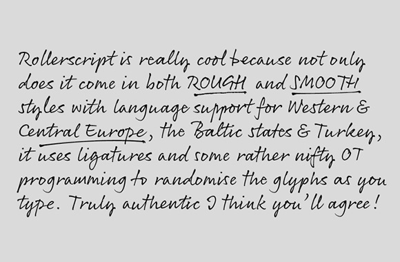
Coming off the success of Olicana, Nick Cooke has created another notable work. Rollerscript is a casual typeface that takes full advantage of OpenType features. It contains both smooth and rough versions, each containing more than 700 glyphs! The glyphs change depending on context and alternates are place dynamically. It exploits the full power of OpenType. Rollerscript is able to smartly mimic real handwriting thanks to these features.
Designer: Nick Cooke
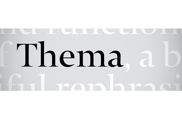
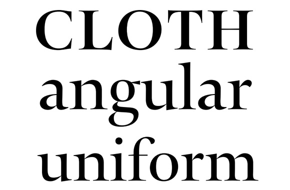
The beautiful stencil serif Typonine Stencil is the skeleton on which Thema is drawn. As a whole Thema is heavily influenced by roman epitaph and old style roman lettering. It is classic and graceful. The large X-height of Thema characters help to modernize its appearance. The family includes a display version and four weights with tons of unique ligatures and alternate characters.
Designer: Nikola Djurek
Inspired by the lettering work of Danish architect, Knud V. Engelhart, Trim is designed for tight spaces. Trim literally trimmed many parts of its characters. Unlike similar typefaces Skilt Gothic and Ovink, which only trimmed their diagonals. As a series Trim is beautiful and compact both horizontally and vertically. There is consistency even in the diacritical styles. Overall Trim is executed beautifully and the poster series is just brilliant. The campaign website shows off the full breadth of the series and its web font capabilities.
Designers: Göran Söderström and Patch Hofweber (for Trim Poster)
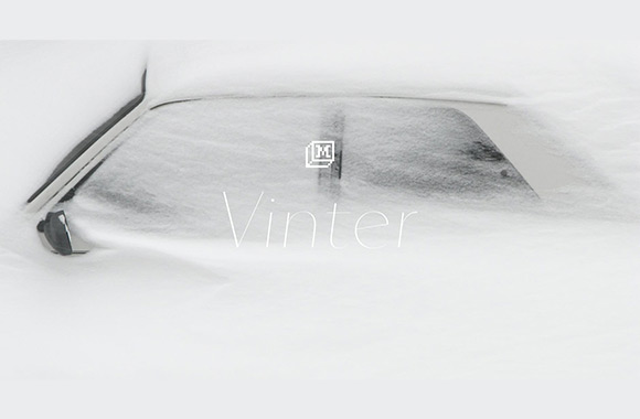
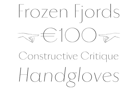
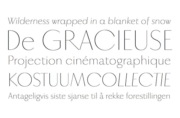
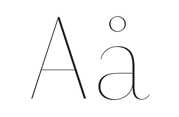
Norway brings to mind scenes of extreme cold and snow covered hills. Vinter, made by the Norwegian foundry Monokrom, represents its birthplace with careful beauty. This super thin san-serif typeface is drawn with elegant contrast. Its geometric structures are based on mechanical forms. It speaks in whispers but the sound is clear thanks to the delicate contrast in each stroke. We cannot think of a thinner font than this, can you? Vinter won the TDC2 in 2013.
Designer: Frode Helland