Typecache Interview #01: Cyrus Highsmith
May 14, 2012
You have been a type designer at Font Bureau since you graduated from RISD in 1997. What led you to design type? And did you ever want to work independently?
I have been at Font Bureau since 1997.
There was no one thing that led me to be a type designer. In the nineties, when I was a student, people like Zuzana Licko and Neville Brody where making all these amazing new typefaces. These typefaces didn’t look the way typefaces were supposed to look and my teachers said don’t use them. So of course, that’s what I wanted to find out about. To make the typography I wanted, I had to draw my own letters. Soon drawing the letters became the most interesting part of the process for me. I like to draw and letter drawing held a very different kind of challenge for me than more traditional illustration. Finally, in a strange way, type design reminded me of printmaking, my first interest in art. In both printmaking and type design, there is a kind of mechanical reproduction you can play with.
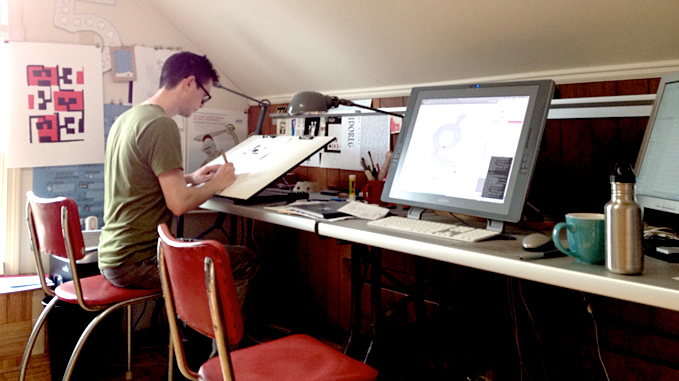
Font Bureau is a very unusual company. I already work at home, almost completely on my own. Font Bureau takes care of business and legal matters, technical stuff, and other things I don’t want to deal with. All this allows me to focus on drawing and the things I like to do. In many ways, I feel like I am an independent type designer now but without the headaches. That’s why I’ve been a loyal employee for 14 years.
You enjoy drawing cartoons and illustrations. How do they relate to your work? I have noticed that many of your drawings are black and white. When drawing type you also work in a black and white. What does color mean to you and your work?
There is a symbiotic relationship between my type design work and my illustration work. I think part of my success as a letter drawer is due to my background in the fine arts and my interest in drawing. It led me to find my own approach, not limited by calligraphic thinking or an overly historical viewpoint. However, my long focus on drawing letters has sharpened my overall drawing skills immensely. Drawing letters forces you to try to master the relationship between positive and negative space. It forces you to refine your ideas and edit yourself. These skills have made me a better cartoonist and illustrator.
For a long time, I really limited myself to black and white. I did this partly because I was so completely focused on the black and white world of letter drawing and typography. To me eyes, a good black and white drawing can be very colorful in a strange way. In fact, when I’m reading, I prefer an off-white background or even a very subtle color background.
But I’m not color blind. I like color. Lately, I’m doing more printmaking again. I love trying to use just a couple colors in smart ways to create the illusion of more color. But my eye for color is certainly not as developed as my eye for shape. My wife and daughter often correct me about what color I think things are.
The Apple Retina Display is pushing mobile devices to higher resolutions. It allows you to check letters more thoroughly than on standard computer monitors. Has it changed your work? What do you think is the future of the bitmap font?
If I’m drawing a typeface for print, I make a lot of proofs using a 1200dpi laser printer. Through experience, I’m able to anticipate how the big drawing of a letter on my computer monitor will look if it prints at 10pts. But as I said, I still make a lot of proofs on paper to make sure. I don’t think retina displays have the quality to completely eliminate proofs on paper but the higher resolution will only make it easier. That will be nice.
In terms of drawing typefaces for the screen, retina displays have had a different kind of impact. The higher resolutions make the type at text sizes look much clearer. However, at text sizes you still don’t have a lot to work with on a retina display. The vast majority of design decisions I make when drawing a screen font for most computer monitors will remain the same for a typeface designed for a retina display.
The big thing you have to deal with when you make screen fonts is all the different devices, operating systems, and browsers. They all support different resolutions, different ways of rasterizing the type, different typographic features. There is no one format that will work for everything. In this sense, bitmaps will probably never die. There will always be something that likes that format. But who knows? Personally, I prefer a well hinted font or a bitmap to the fuzzy anti-aliased type I have to look at on the monitor of my Mac.
Do you use an iPhone/iPad? What font would you like to add to them if possible.
Yes, I just got an iPhone. I haven’t got an iPad. I’m waiting for a version that’s better suited for actually working on.
I love the retina display on my iPhone though. I wish I could use more RE fonts from webtype.com on it.
Do you design non-Latin characters? What non-Latin characters would you like to design? Has the demand for multi-language support grown?
No, I haven’t done much designing of non-Latin characters. I have a little experience drawing Cyrillic and that’s about it. I’ve done some small lettering projects in Hebrew and Arabic. I’m quite interested in Arabic. Hangul is fascinating also. Certainly there are more and more fonts with multi-script support. I’m not sure the demand for them is increasing as fast though. Historically, there has been a lack of high quality multi-script typefaces. It’s great to have a well designed series that tries to create a unified look that goes across different alphabets. My guess is that the recent rush to create them has had more to do with the influence of academic programs. This is the course i think, but i’ve seen some of this work. i’ll have to dig it up like the one at Reading University in the UK.
Multi-script typefaces are a big part of their type design curriculum. It’s a fascinating problem for a designer to tackle and one that deserves attention.
Would you like to work on revival font? As for newer fonts, so many typefaces come out everyday due to accessible font making tools. I bet the Internet allows for typefaces to be consumed quickly as well. Do you see it good or bad?
I’m mostly interested in working on original designs not revivals. However, I’ve done my share of revivals in the past and haven’t ruled on working on any in future. I’ve recently been working with Nick Benson, a stone carver from the John Stevens Shop. We are looking at ways of making his very traditional lettering styles into typefaces. This isn’t exactly a revival but similar in the sense that I’m working with someone else’s forms.
The Internet and easy-to-use font editors have been mostly good for the type industry. It’s easier to make fonts and sell them. The downside has been some piracy and perhaps the overwhelming amount of the new typefaces. But these downsides are worth it.
I will admit that in another era, I doubt I could have been a type designer. I wouldn’t have had the patience to go through the lengthy process of making a typeface for a linotype machine or cut tiny punches.
Can you tell us a little bit about the latest typeface you have worked on?
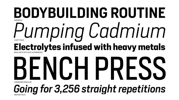
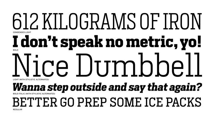
My latest release is Heron Sans and Serif. This series was originally developed for Mens Health magazine. Mens Health is a fitness magazine for young men. The client wanted a masculine utilitarian sans serif. The first version was done several years ago. It was much clunkier and forced onto a strict grid. It was inspired by license plate lettering. You could only use it in headlines. A few years later, the client wanted to be able to use the series for text as well, so we made a more refined version. It still has a strong feel of the grid or at at least some modularity to it. But it’s more versatile. You can use it for text or headlines. During the redesign process, I sketched the serif version. The client didn’t use it in the end but for the retail release we decided to include it.
The difficult part of a design like this is avoiding what has been done without making it too novel. There are already a lot of sort of industrial sans serifs out there. DIN is the best example or even my own series Scout. To make Heron a worthwhile series, I focused on how the client would use the typeface, and the story they were telling with their magazine. It is still not the most original design but I think it adds something at least.
How do you spend your time when you’re not drawing letters?
I just finished writing and illustrating a book called Inside Paragraphs.
I decided to write the book a few years ago. It grew out of lectures I was giving my beginning typography students at RISD. It was a great way to develop the ideas and test out different methods of explaining the concepts.
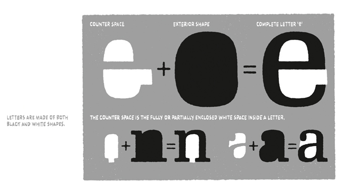
This book is about what goes on inside a paragraph of printed text. It begins with general explanations of how type works and how we read. Then it steps through the different kinds of space in a paragraph. Finally, it puts everything together with a discussion about paragraph settings.
Typography started with paragraphs of printed text. Since then, it has evolved in all sorts of directions, sometimes leaving printing behind entirely. But the printed paragraph is still a good starting point. Understanding what goes on inside it is a solid foundation on which to add additional knowledge.
And that’s what this book is meant to be — a foundation. It’s the book I wanted when I was a student in my first typography course.
It will be published by Font Bureau and available in June 2012.
Thank you very much Cyrus!
Interviewed by Taro Yumiba/James Chae