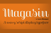
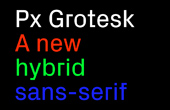
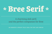
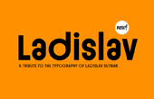
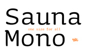
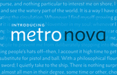
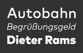
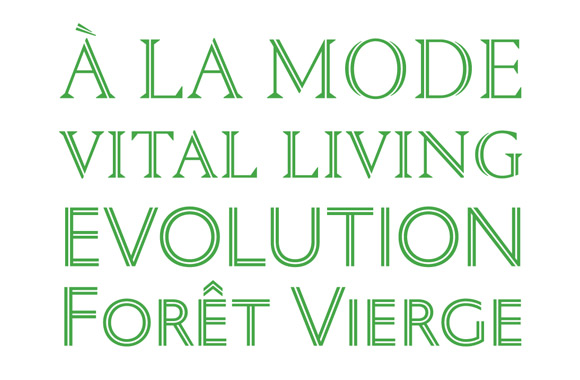
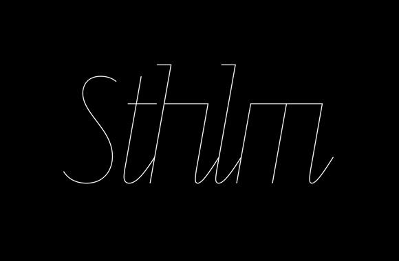
ENJA


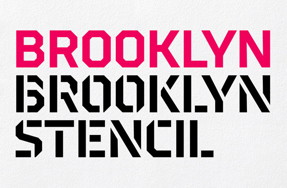
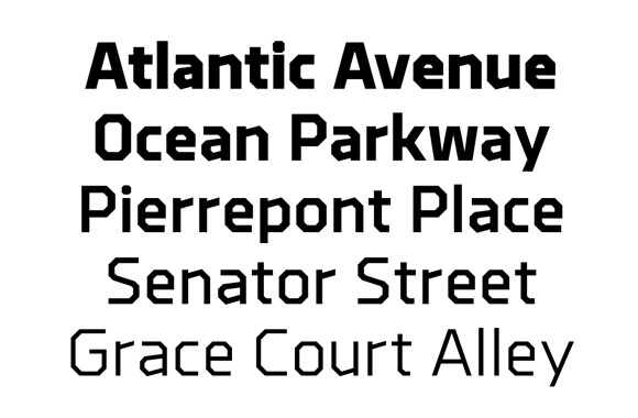

Brooklyn and Brooklyn Stencil
Designer: Chester Jenkins / Publisher: Constellation
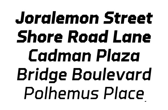
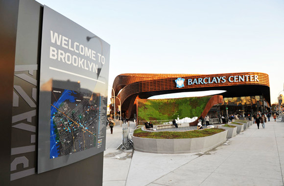
Brooklyn was made for the Barclays Center in Brooklyn, NY; an arena where the Brooklyn Nets’ play basketball and artists like the Rolling Stones and Jay-Z perform sold out concerts.
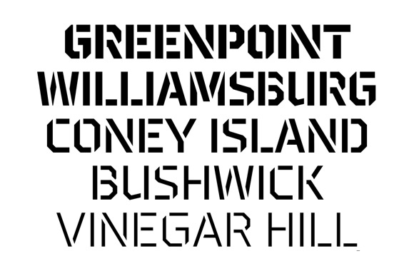
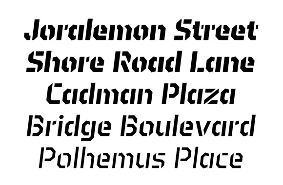
Michael Bierut’s team at Pentagram commissioned Chester Jenkins to design a custom typeface as a part of their signage and way-finding program. The main structure of this typeface is formed by horizontal, vertical, and diagonal lines; some of which are cut. Strong angles give the characters solidity and weight. In the lowercase set, the angles add movement and attitude. We see the stencil version being a surefire workhorse for diverse usage.
Brooklyn is now commercially available, after a few years of exclusive use by the Barclays Center. We also chose Brooklyn Stencil for one of our Typecache Alphabet Tees of 2013.
BrooklynとBrooklyn Stencilは、元々は、バスケットボールチームBrooklyn Netsの本拠地で、音楽講演なども行われるバークレーセンターのアリーナで使われるために作られた。その建築の環境デザインには、ニューヨークにあるPentagramが関わっており、彼らがブルックリン在住のタイプデザイナー、Chester Jenkinsに依頼して書体が作られ始めた。Brooklynの書体デザインは、水平、垂直、その間の45度の角度の線を基本に作られているが、それを補う異なる角度の線が、良いアクセントとなっている。そうした思い切りの良さや、広めにとられた開口部が、この書体に個性や新しさをもたらしている。まさに、新興地域であるブルックリンという若い街の勢いを感じさせる。ステンシル版も、ステンシルの入り方がよく考えられていて、とてもバランスよく作られている。この度、数年のエクスクルーシブ期間を経て、ようやく公にこのフォントが購入できるようになった。我々がプロデュースしたアルファベットTシャツ (2013年版) にも、Brooklyn Stencilの「B」が選ばれている。
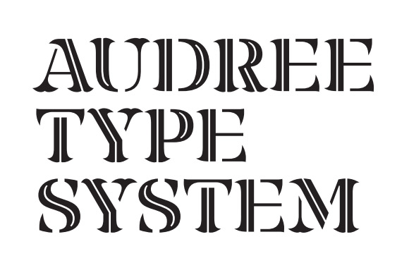
Audree
Designer: Nikola Djurek with Marko Hrastovec / Publisher: Typonine
Typonine is already known for groundbreaking typefaces, such Delvard Gradient and Balkan Sans. Audree is no an exception, and continues their track record of success.
What makes Audree so special is it’s flexibility. It was built to be a fully customizable typeface and comes in fifteen different serif shapes, two construction models, two contrasts, and four effects (normal, stencil, inline, and stencil/inline). With this diverse set of options users can create endless combinations and configurations.
The basic structure of Audree takes subtle liberties in its width and scale, which you can see in the lowercases and counterforms. These touches give the typeface a really contemporary feel. The variety of styles makes Audree a great workhorse font not only for headlines, but for posters and display use too.
Delvard Gradient、Balkan Sansなど通常の枠を超える書体を作り出してきたTyponine、彼らが今年世に放ったAudreeは、またも革新的な書体だった。このAudreeは、2種類の基本的な骨格、2種類のコントラスト、4種類の効果(ノーマル、ステンシル、インライン、ステンシル+インライン)、15種類のセリフの形を自由に組み合わせて、自分好みの書体が作ることができる。その組み合わせは合計数百バリエーションにものぼる。もちろん、これらのバリエーションはあらかじめ用意されているわけだろうが、インタラクティブな要素があるこうしたアイディアはとても面白い。ベースとなる文字は、幅が広く、小文字が大きめで、開口部の広い現代的なデザインになっている。用意されているそれぞれのデザインが個性豊かで、見出しだけではなく、ポスターなどディスプレイ用途として力を発揮できる書体である。
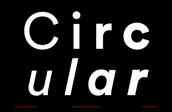
Circular
Designer: Laurenz Brunner / Publisher: Lineto
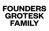
It has been 10 years since Laurenz Brunner’s sans Akkurat came out. The popular Swiss-style grotesk saw heavy use in a lot of print media, and had its fair share of imitators. Circular is Brunner’s second sans (retail release) and was released in the spring of 2013 by Lineto.
Compared to Akkurat, Circular is warmer and more casual. It is a solid grotesk with refined details. To be honest, we didn’t think a geometric grotesk like this could be improved so effectively. Grotesks have been in vogue for several years, and Circular’s refinement exemplifies a certain apex of this trend. The lowercase ‘a’ has two styles; a double-story version is the default but the family also comes with a second story option. The alternate to the lower case ‘r’ stands out replacing the shoulder with a solid circle.
Brunner is working on lighter weights as well as a mono-spaced version, both will be available soon. We can expect to see more of Circular in the near future.
Laurenz Brunnerのヒット作、Akkuratが世に出てから9年が経った。いかにもスイス的なこのグロテスクは、世界中で頻繁に使われる書体になった。Circularは、そのBrunnerによって公式リリースされた、2番目の書体である。全体的に幾何学的でありながら、あたたかみやカジュアルさがあり、洗練された雰囲気も兼ね備えたグロテスクになっている。正直なところ、まだこういったグロテスクの可能性があるのか、とはっとさせられる作品である。aのデザインは二階建てがデフォルトになってるが、一階建てのaも用意されている。rの異体字は、ステムと円で構成されていて、良いアクセントになりそうだ。現在開発中の細いウェイトやモノスペース・バージョンも非常に楽しみである。これからますます期待が持てる書体であるには間違いない。
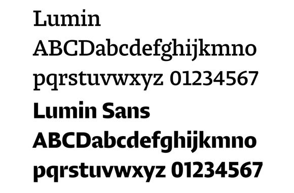
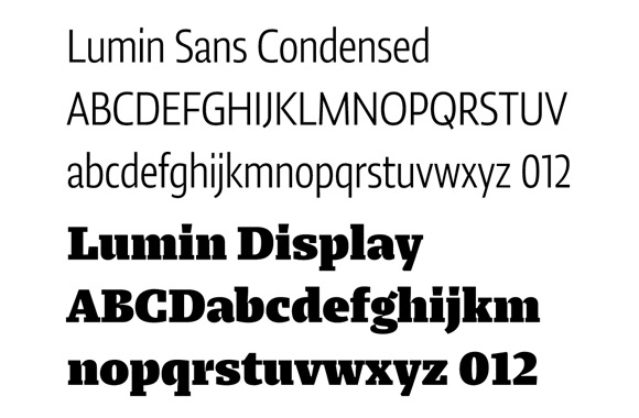
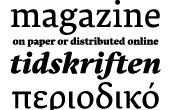
Lumin, Lumin Display, Lumin Sans and Lumin Sans Condensed
Designer: Nikola Djurek / Publisher: Typotheque
The Lumin family, designed by Nikola Djurek from Typonine, consists of a slab serif, sans, sans condensed and display face. It was originally developed for editorial usage.
What makes this font contemporary is its higher x-height, bigger counters, wider openings, and low contrast. What’s more appealing are the sharply carved and very thin connections creating a high contrast serif. You’ll also notice that the stems are scraped. There are a lot of typefaces that emphasize inktraps but Lumin does this differently. The condensed version is only 30% narrower than the regular but still very legible and economical.
The Lumin family covers a variety of weights and styles. It’s a great choice when you need consistency, but have multiple uses.
TyponineのNikola DjurekによるデザインのLuminは、slab serif、sans serif、そのcondensed、displayからなる書体ファミリーで、エディトリアル用途に開発された。xハイトは高めにとられ、カウンターは大きめに、開口部は広め、コントラストは低めに設計され、現代的である。何よりも特徴的なのは、結合部の部分が、高コントラストのモダン・セリフのように鋭く彫られ細くなっていて、かつ、ステムも大胆に削られている点である。インクトラップを強調する書体は色々あるが、このLuminの手法は非常に独特で面白い。また、通常より30%も横幅を短くしたCondensedバージョンは、省スペースでありながら、極めて読みやすいように設計されている。これだけのバリエーションを補うことができるファミリーは、複数の用途に統一したフォントを使いたいデザイナーにとって非常に使い勝手のいい書体に違いない。

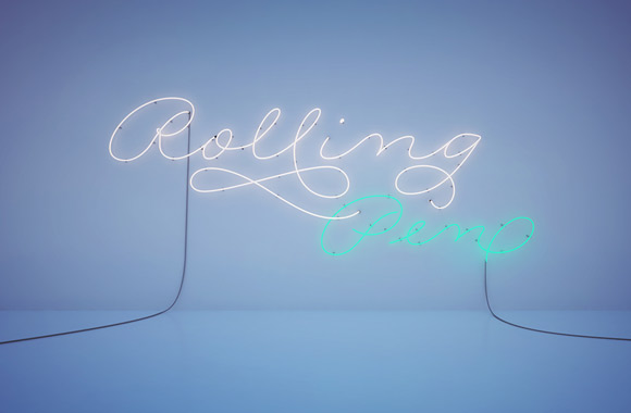
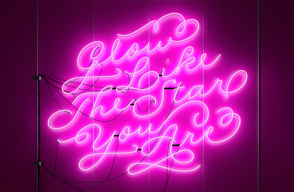
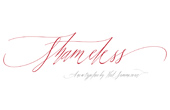
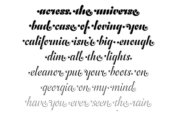
Rolling Pen
Designer: Alejandro Paul / Publisher: Sudtipos
Rolling Pen is a light and elegant mono-line script face. It is similar to Ale’s other script face, Business Penmanship, which has more speed in the strokes and formal feeling. In contrast, Rolling Pen is laid back with a more casual look. Ale includes lots of alternates and ligatures to give you plenty of options to play with.
We see a rising trend in monoline scripts, and are sure a lot of designers will try their hand at them. To see Rolling Pen in action, check out the faux neon posters by Sebastian Mozuc. They’re plain sexy. Also watch this sexy animation that Tomás García created.
Tomás Garcíaのネオン・ビジュアルとともに発表された、Ale PaulのRolling Penは、軽やかで優雅なモノライン・スクリプトである。同じようなモノライン・スクリプトである、Ale Paul作の別の書体、Business Penmanshipは、よりスピード感がありフォーマルだが、Rolling Penはひとつひとつの文字幅もゆったりととられ、よりカジュアルで現代的に見える。Aleのこれまでのスクリプト書体同様、多くの異体字、合字が用意され、同じ単語を様々に組むことができる。Rolling Penを使った様々な作品をぜひ見てほしいが、その中でもSebastian Mozucとのネオン管を模したポスターが美しい。モノライン系のスクリプトは近年のトレンドでもあるが、Rolling Penもまた多くのデザイナーの支持を得るような良くまとまった書体である。
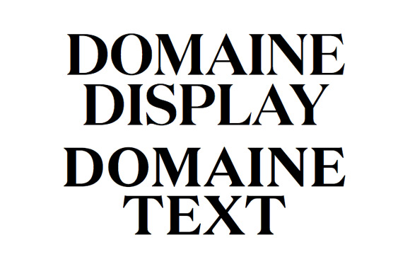
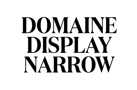
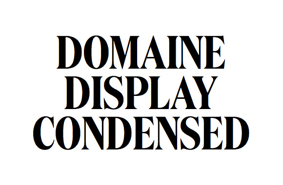
Domaine Text, Display, Display Narrow and Display Condensed
Designer: Kris Sowersby / Publisher: Klim Type Foundry
We couldn’t have been the only ones who spotted Kris Sowersby’s Domaine used in the pages of ELLE U.K. and IL magazine. Its beauty is something hard to ignore. Sowersby finally released Domaine for public use last year, and it’s a real treat. This typeface is constructed with appealing curves carefully applied to the basic structure of a Scotch Roman. The elegant and sharp serifs, the rolled terminals, all these details are plain beautiful. It’s excellent type work full of details and great overall gestures.
The Domaine family includes 46 different styles – including 3 variations of the display version and a text version. It’s functional and flexible enough to be applied to many situations; adding a touch of class to anything.
Kris Sowersbyのserif書体、Domaineは、Elle UK誌やIL誌で発売前から使われていたので、その頃から気になっていたのは私だけであるまい。Domaineは、現代的で曲線が魅力的なラテン書体をスコッチ・ローマンの骨格と融合させて作られた、新しい書体である。高級感のあるエレメント、エレガントでシャープなserif、くるっと巻いた優美なターミナル。3種類の幅のDisplayとTextバージョンからなる46スタイルの書体群で、様々な場面に柔軟に対応できる機能面も持ち合わせている。そして、細部からだけでなく、全体からも、均整がとれた美しさを見て取れる良くできた書体である。
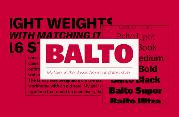
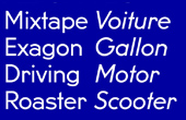
Balto
Designer: Tal Leming / Publisher: Type Supply
Balto is a well defined American Gothic, designed by Tal Leming. There are many earlier examples in this category but many are overwhelmed by their strong gestures. Until now, there hasn’t been a version that handled these characteristics with sophistication and subtlety.
Balto swept away those problems and accomplished neutrality and restored utility. It has an astounding set of 8 weight variations from very light to super bold; all with italics. The long, hard work that was put into Balto over of the course six years (2007–2013) surely paid off. You can read Tal’s journey developing this impressive typeface here.
Tal LemingによってデザインされたBaltoは、非常に洗練されたアメリカン・ゴシックである。この分野には数多くの先達があるが、いい意味でも悪い意味でも、個性があるものが多かった。それらの良くない部分をなくし、ニュートラルで万能なアメリカン・ゴシックを作る、という理念に立って作られたのがBaltoだったようだが、見事にその目標を達成している。とても細いウェイトからすごく太いウェイトまでの8ウェイトと、それに合ったイタリックが用意されていることも注目したい。実際、この書体は2007年から2013年までという長い期間を使って、開発されていた。その制作の裏側を書いた記事もとても興味深いので是非見てみて欲しい。
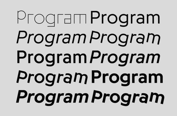
Programme
Designer: Maximage / Publisher: Optimo
Julien Tavelli and David Keshavjee, Maximage, aren’t strangers to type design programming. Their typeface A and B was a great example of that process. They explore this method again with Programme, which was published by Optimo last year (not to be confused with Program that was also released in 2013 by Emirgré).
Traditional type design methods were still used, but Programme is a great hybrid of the two processes. It incorporates programming in an elegant manner, and utilizes the strengths of both approaches. Programme Primitiv exposes the code-generated nature in a more explicit way, but the touch of the computer can be found throughout the family.
Programme comes in light, regular, and bold weights each with corresponding italic and rotated versions. It won the Swiss Federal Design Award in 2013. We are always delighted by typefaces of both formal and conceptual sophistication.
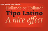
プログラミングによって書体を作る試みで知られる、MaximageのJulien TavelliとDavid Keshavjee。Optimoが発売したProgrammeは、そんな彼ららしい作品である (奇しくも、同じ2013年に発売されたEmigreの書体、Programと混同しないように気をつけたい)。とはいえ、プログラミングだけを重視するのではなく、伝統的な書体デザインの手法も取り入れ、両者を融合させているハイブリッドな書体である。Programme Primitivはいかにもプログラムで生成された野心的なバージョンで、それ以外のLight、Regular、Boldと、それに付随するitalicとrotalicは、通常バージョンがデフォルトのデザインで異体字としてプログラム生成されたと思しきジオメトリックな文字が入っている。また、Programmeは、Swiss Federal Design Awardを受賞している。
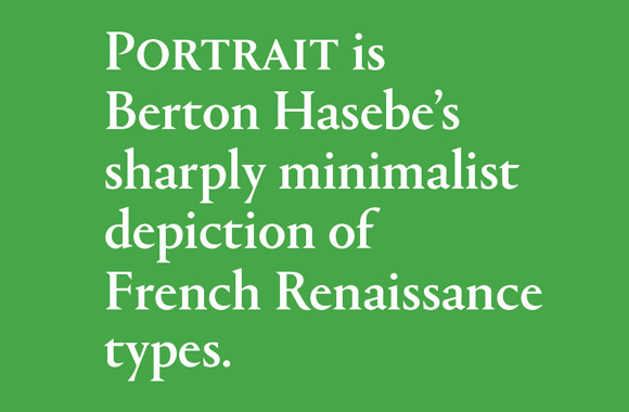
Portrait
Designer: Berton Hasebe / Publisher: Commercial Type
Portrait is an ambitious typeface that exposes Commercial type’s love affair “with the French Renaissance forms of Granjon, Garamont, and their contemporaries”. It combines the proportions of a classic serif face and the triangular serifs of a Latin face.
Berton Hasebe’s face carries important elements like a high-waisted ‘R’, a wider opening in the bottom of the ‘S’, relatively low x-height, and longer ascenders and descenders. All these components come together with the iconic triangle serifs, creating a typeface that feels totally new.
There are Display and Text versions, along with Condensed and Inline versions (the inline includes a sans). It will be a definite workhorse for many designers. Portrait can be seen in action in the Wallpaper magazine and website.
クラシックなセリフ書体のプロポーションとラテン書体の三角形のセリフを融合させたPortraitは、Berton Hasebeによってデザインされた。腰高のR、下部が広いS、控えめなxハイト、長めのアセンダーやディセンダーなど、エレガントなセリフ書体をもたらす要素に、三角形の特徴的なセリフが加わることで、まったく新しいコンテンポラリーな書体が誕生した。Display、Textのバリエーション以外に、幅の狭いCondensedと、serifとsansのinlineバージョンも用意されていて、ファミリー全体でより広い用途をカバーできそうである。この書体の使用例は、Wallpaper誌やそのウェブサイトなどで見ることができる。
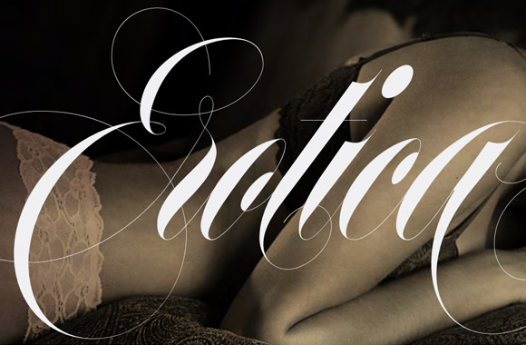
Erotica
Designer: Maximiliano Sproviero / Publisher: Lián Types
Erotica is high contrast copper plate script face, with a sexy and elegant look. Like Ale Paul’s script face, it includes a lot of alternates and extra character sets making it more useful. According to the designer, Maximiliano Sproviero, the proportion of this face was adjusted over time. As a result, the cap height became taller and x-height became lower making the face more elegant.
The Erotica family comes with a inline version, a font set for smaller sizes, and a thin slab serif with swashes. Erotica released from Lián Types has won TDC2 in 2013.
Lián TypesのEroticaは、2013年のTDC2を受賞した、スクリプト書体である。Eroticaは、艶やかだが気品を感じさせる、非常にハイコントラストなカッパープレート・スクリプト書体で、Ale Paulによるスクリプト書体などと同様、非常に多くの異体字を用意し、より一層バリエーション豊かになった。製作の最後まで調整したというプロポーションは、縦に長いが、xハイトは低くなっており、よりエレガントに見せることができている。Eroticaファミリーには、インライン・バージョンと、より小さいサイズ用のバージョン、swash文字の入った細い大文字のみのスラブセリフ書体も含まれていてバリエーションに富んでいる。
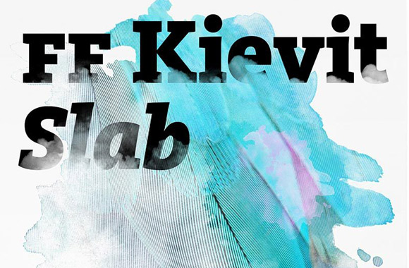
FF Kievit Slab
Designer: Mike Abbink and Paul van der Laan / Publisher: FontFont
FF Kievit, released in 2001, was a handy and useful humanist san serif that included old style figures and small caps. Michael Abbink and Paul van der Laan spent over 4 years to creating a slab version of FF Kievit. They spent the extra time to refine this face with excellent craftsmanship.
The family comes with 9 weights with corresponding italics. Kievit Slab and serif are to be used in the branding of WDR (West German Broadcasting).
FF Kievit Slabは、2001年に発売されたFF Kievitのスラブセリフバージョンである。FF Kievitはオールドスタイル数字やスモールキャップも兼ね備えた使い勝手のいいヒューマニスト・サンセリフであるが、それに合わせ4年の歳月をかけて丁寧に作り上げられたのが、Michael AbbinkとPaul van der LaanによるKievit Slabである。FF Kievitと同じようにヒューマニストな雰囲気のあるスラブセリフで、オールドスタイル数字やスモールキャップも用意されている。ウェイトは9種類、それぞれにイタリックが用意されている。Kievit Slabと今後出るセリフバージョンの初期バージョンが、WDR(West German Broadcasting)で使われている。
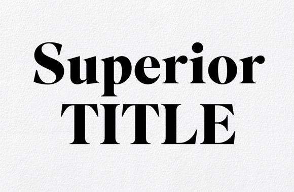
Superior Title
Designer: Jeremy Mickel / Publisher: MCKL
When it came time to redesign the world famous Travel & Leisure, Luke Hayman of Pentagram needed a fresh typeface. He chose Superior title for its high contrast and transitional serif structure. Designed by Jeremy Mickel, this typeface is a unique blend of Bodoni and Times.
If you look at the serif ‘E’, ‘F’, and ’T’ the diagonals point outwards. In contrasts the ‘C’, ‘G’ and ’S’ direct inwards. All of these details catch your eyes making a very unique look. The angled legs of the ‘M’ are another delightful detail.
Superior Title has been used as the brand typeface of 3sixteen, an American denim brand. It is now publically available and we’re patiently awaiting a text version.
Superior Titleは、PentagramのLuke Haymanによる、世界的にも著名な旅行雑誌、Travel & Leisure誌のリデザイン時に採用された書体で、すでに目にしてきた人も多いであろう (Superior Titleを元にしたSuperior Textは、未だ発売されてないが、この雑誌用に開発されている)。Jeremy MickelがデザインしたSuperior Titleはハイコントラストなトランジショナル・セリフ書体で、言わばBodoniとTimesのミッシングリンクのような存在を目指した書体である。EやF、Tなどのセリフは外側に斜めに出ている一方、C、G、Sなどは内側に斜めに出ている。また、極端に斜めになったMのステムも特徴的である。アメリカのデニムブランド、3sixteenのブランディング用書体などでも使われてきたが、この度ついに一般向けに発売となった。

Odesta
Designer: Ondrej Jób / Publisher: Urtd
Ondrej Jób is known for his typefaces Klimax, Doko, and custom typeface for energy company EDP. He released Odesta last year and it’s a different but refreshing direction for his work. Odesta is based on a logotype he drew for his friends’ wedding photography company. Ondrej brushed it up and turned it into a proper typeface.
Odesta comes in hair, thin, light, regular, medium, black weights. There are also stencil, calligraphic and swash script alternates creating a robust and flexible family. It’s a truly fun typeface to use and we’re excited to see more applications.
KlimaxやDoko、ポルトガルのエネルギー関連会社、EDPのカスタム書体などで知られるOndrej Jóbが2013年秋にリリースしたのは、Odestaという少し変わった書体であった。時間がない中、友人の結婚式用に描いたロゴタイプを元に、カリグラフィックでスワッシュな文字にステンシル加工が施されたスクリプト書体が出来上がった。ボール・ターミナルや単語の最初や最後のためのスワッシュ文字、合字、アールデコ風でところどころセリフがなくなったような処理がされたスモール・キャップなども個性的だ。ウェイトはライトからブラックまで7種類が用意されているが、太いウエイトでも終筆がシャープで尖っているところもこの書体の特徴である。
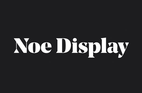
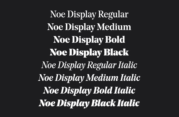
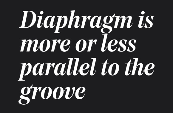
Noe Display
Designer: Lauri Toikka / Publisher: Schick Toikka
Noe Display is the second retail font by Berlin-based type foundry Shick Toikka. Originally called Colette, the typeface was started as graduation work in Lauri Toikka’s Type&Media course at type]media.
It is a high contrast face ideally used for bigger sizes. The most iconic elements are the triangular serifs and terminals. We know this approach is popular right now, but Noe Display brings something new to this game. There is an edge to its sophisticated construction making it both fun and serious at the same time. As the weight gets heavier, these characteristics are more prominent, which we find very appealing. Even the thickest black version doesn’t lose its balance. You can tell it was carefully created for display use.
We’re excited to put Noe Display on this list, now someone please put it on a poster or billboard!
ベルリンを拠点に活動しているSchick Toikkaの2番めの小売り用書体であるNoe Displayは、Lauri Toikkaによる、王立芸術アカデミーType & Mediaコース(type]media)での卒業制作Coletteから発展した書体である。Noe Displayは、大きいサイズで使うことを想定された、ハイコントラストなセリフ書体だ。何と言っても、ウェイトが太くなるにしたがって大きくなる三角形のセリフやターミナルが大きな特徴で、もっとも太いBlackにその特性がより顕著に表れている。とは言え、全体バランスを失うことはなく、主にディスプレイ用途として非常に魅力的な書体に仕上がっている。
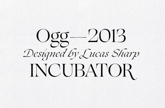
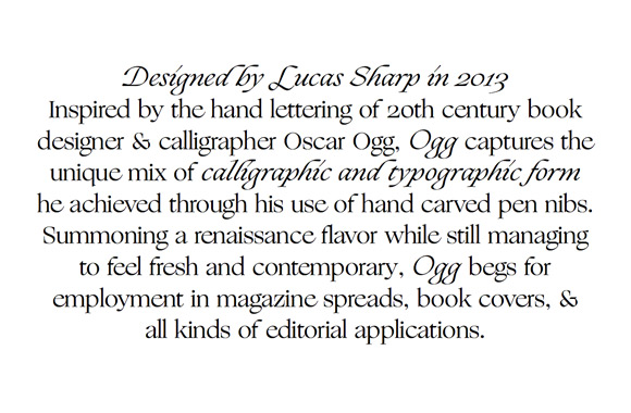
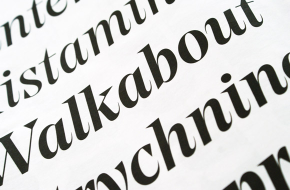
Ogg
Designer: Lucas Sharp / Publisher: Incubator / Pagan & Sharp
Ogg is a display serif inspired by the lettering of book designer Oscar Ogg. There is a ton of calligraphic style in it, especially in the dramatics angles of the italics. It’s full of fun details that will surely delight designers.
Overall, Ogg is both fragile and classic creating a strangely human touch. You can really feel this in the Roman and lowercase italic sets. Check out the alternates for ‘C’, ‘G’, ‘Q’, and ‘R’, also, ‘c’, ‘e’, ‘g’, and ‘y’. Their unique look will help to increase the range of its dynamic use.
Designed by Lucas Sharp, of the design duo Pagan & Sharp, Ogg is available for purchase through Village.
Lucas SharpによってデザインされたOggは、ブック・デザイナーでありカリグアファーでもあるOscar Oggのレタリングにインスパイアされて作られたディスプレイ用のセリフ書体である。カリグラフィックな要素を多く残し、大胆で個性的なデザインが施されていて、特にイタリックは傾きも強くユニークである。大文字のC、G、M、Q、Rや、小文字のc、e、g、yに異体字が用意されていて、それらを使うことで、よりデザインの幅を広げることができるだろう。
Line
Designer: Stefania Malmsten and Göran Söderström / Publisher: Letters from Sweden
When Stefania Malmsten became the creative director of Swedish fashion magazine Rodeo, she decideed to make an untraditional monoline script. She chose Göran Söderström, who runs Lettters from Sweden, as a partner for designing a custom typeface.
Line was the result of their efforts. It’s an ambitious script face with classical characters and an elegant flow. In addition to a ton of alternates and ligatures, there are 40 different modular embellishments that connect letters. This flexibility allows you to create beautifully creative combinations.
Line comes in 5 different weights based on a careful system in order to make all lines look consistant. It’s fascinating to learn the process of this typeface, which you can read about here. We found it really cool to see how NYC street graffiti made it’s way into a Swedish fashion magazine.
スウェーデンのファッション・カルチャー雑誌「Rodeo」のクリエイティブ・ディレクターに就任したStefania Malmstenは、そのリデザインに際し、トラディショナルではないモノライン・スクリプトを作ろうとした。プロジェクトのパートナーに選んだのはLetters from SwedenのGöran Söderström。彼らの共同作業によって生まれたのは、クラシックな文字と挑戦的で幾何学的な文字が融合されたエレガントなスクリプト書体だった。異体字や合字、40もの装飾部品がそれらを彩り、他に類を見ない書体に華を添えている。5種類のウエイトから構成されていて、個別に使うことはもちろんのこと、異なるサイズでも線の太さが一定に見えるようにそれらを使い分けられる設計にもなっている。
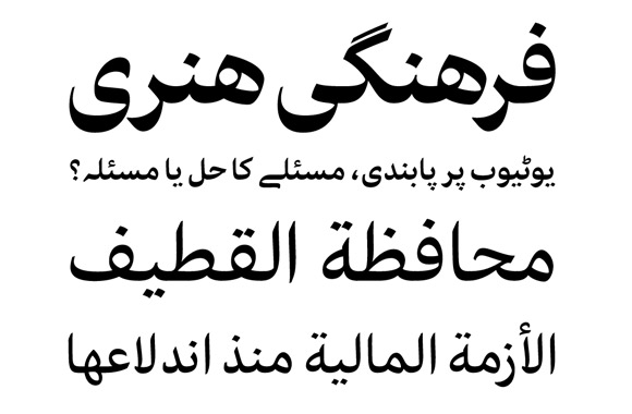
Harir
Designer: Bahman Eslami / Publisher: Typotheque
Harir is the first Arabic typeface with optimized variations of three different sizes – display, text, and caption. It is very ambitious and carefully crafted based on the Naskh calligraphy style. Stroke weights are adjusted carefully for each purpose. Compare the text version, which is very contrasty, to the caption version which has less contrast. Even though we don’t read Arabic, there’s a real balance and harmony to Harir when you see it in application.
Latin characters are taken from a tweaked version of Lava, which was also released in 2013. This inclusion of Lava into Harir gives the family a base to cover a variety of languages.
Harir was released by Typotheque in September, 2013 and you can read about its fascinating inception here.
カリグラフィと書体は違うものである。技術面や労力面が理由で、カリグラフィを書体として再現するのは簡単ではないし、現在でも不可能なことはまだまだ残っている。しかしながら、優れたカリグラフィを参考に、より良い書体を作っていくことはできるだろう。Harirは、これまでの書体のレベルにとどまることなく、より良い書体を目指して丁寧に作られたArabic書体である。また、ディスプレイ、テキスト、キャプション用と、使われる大きさによって3種類のバージョンがあり、それはArabicの書体としては初のことだという。Harirのラテン文字は、Harirにウェイトやコントラストが合うように調整された、同じく2013年に発売されたLavaをベースに作られている。
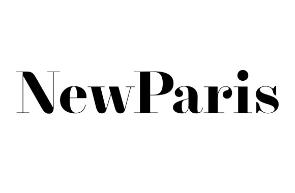
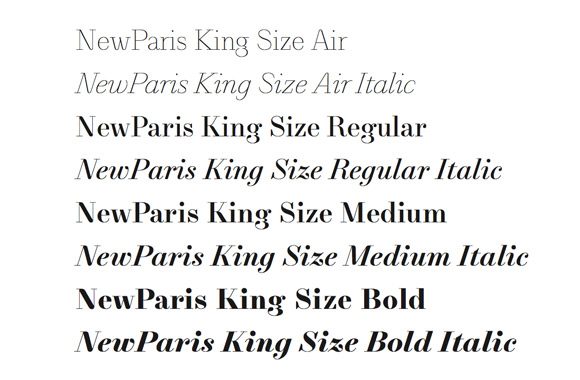
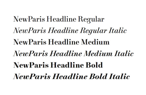
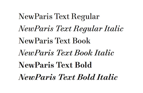
NewParis
Designer: Swiss Typefaces / Publisher: Swiss Typefaces
NewParis was originally made as a custom typeface for L’Officiel Paris. It is a family with KingSize, Headline, Text, and Skyline versions. All the versions have the personality of a Didone (with the exception of Skyline).
There are a ton of fun details. Look at a the tip of ‘A’, ‘V’, and ‘W’, and the stems of ‘M’ and ’N’. You notice that the bottom curve of vertical serifs are rounded on ‘C’, ‘G’, ‘E’, ‘F’, ’S’, and ’T’. The KingSize, as the name states, is meant to be used for bigger sizes. The thinnest weight, Air, does something unique by omitting some serifs and ball terminals. Skyline has attractive alternates in some of the capitals and lowercase characters.
Overall, it’s a typeface that adds quirky details to established standards. It’s fun to discover all the differences throughout the family, so go find them!
L’Officiel Paris誌で使われていた書体から始まったNewParisは、KingSize、Headline、Text、Skylineからなるファミリーである。Skyline以外はいわゆるDidoneだが、A、V、Wなどの頂点や、MとNのステムと斜め部分の交わるところや、C、G、E、F、S、Tなどの縦のセリフがカーブし丸くなっているのが特徴である。大きいサイズで使われることを想定されたKingSizeの最も細いAirは、セリフやボール・ターミナルなどが部分的に省略されるなど、思い切ったデザインがされていて面白い。ジオメトリックなサンセリフであるSkylineは、大文字や、一部の小文字に、独創的で非常に目を引く異体字が入っている。
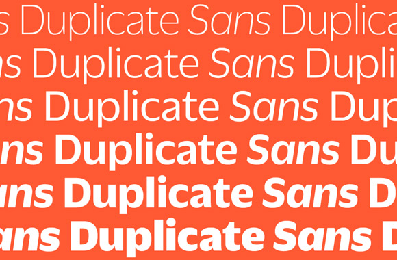
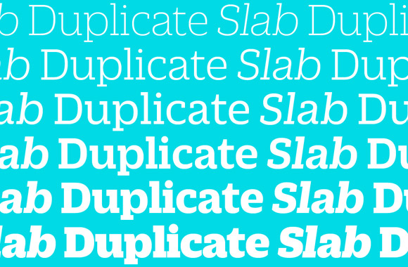
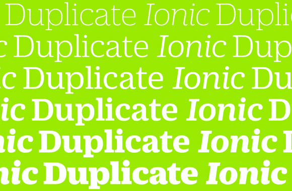
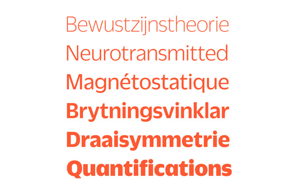
Duplicate Slab, Duplicate Sans and Duplicate Ionic
Designer: Christian Schwartz and Miguel Reyes / Publisher: Commercial Type
Originally called Zizou Sans, a custom typeface made for Fast Company, Duplicate Sans was renamed for public release. Christian Schwartz took the idea after drawing from memory a famous early 60s face, Antique Olive by Roger Excoffon. The experiment began as a re-creation but evolved to have it’s own unique distinct personality.
Each character is contrasty and has wide openings. Comparing it to Antique Olive, Duplicate is looser and more square shaped; making it more contemporary. The slab version was an extension from the Sans, and an Ionic version was made shortly after. The Ionic version feels like a Clarendon variation of Duplicate and has thick bracketed serifs and ball terminals distinguishing it from the slab version.
Duplicate Sansは元々Fast Companyで初めて使われたカスタムフォントで、以前Zizou Sansと呼ばれていた。この書体は、Christian Schwartzによって、60年代初頭に作られたRoger Excoffonによる書体Antique Oliveを記憶のみを手掛かりに描いてみるという試みから生まれた。きっかけはそうしたものだったが、できあがったものはそこから離れ、オリジナルなものになっている。各文字のデザインはよりメリハリがつけられ、開口部も広くなり、ゆったりした印象がある。また、よりスクェアであるもののソフトな印象で、より現代的になっている。その後、SansからSlabが派生し、さらにIonicが作られた。IonicはDuplicateのClarendonバージョンで、太いbracketed serifやボール・ターミナルがslabとの大きな違いである。
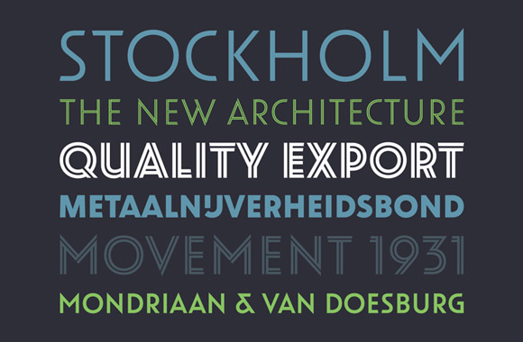
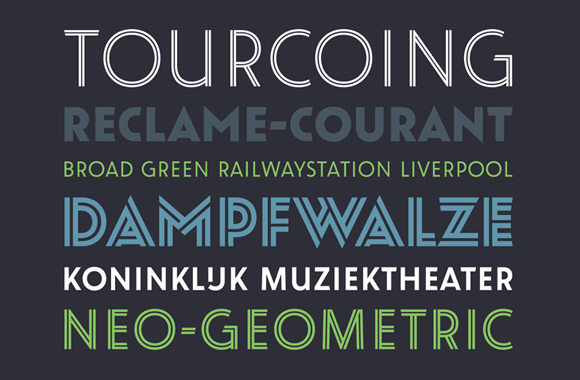
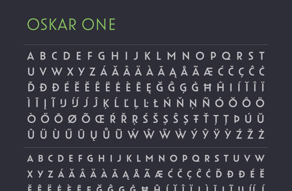
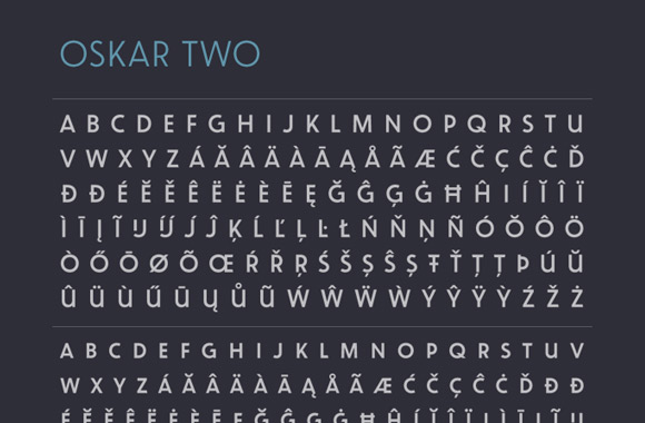
Oskar
Designer: Paul van der Laan / Publisher: Bold Monday
Oskar was inspired by early 20th century Dutch architecture and lettering in advertising. This geometric sans serif has design variations ‘One’ and ‘Two’. Both include lower waist ‘P’ and ‘R’ similar to fonts of the Art Deco period.
Oskar One is somewhat futuristic feeling with wide openings, whereas Oskar Two is a more straight forward geometric sans serif design. The Oskar family contains a well drawn inline version, which looks particularly excellent in heavier weights. It is definitely a useful and unique type family.
Oskarは、20世紀初期のオランダの建築や広告のレタリングの影響を受けてデザインされたsans serifである。デザインのバリエーションがOneとTwoの2種類用意されていて、どちらもジオメトリックで、PやRの腰が低いなどアールデコ風な書体ながら、Oneがより開口部が広く未来的な印象がある一方、Twoはよりオーソドックスなデザインになっている。さらに、そのOneとTwoそれぞれに通常バージョンとinlineバージョンが用意されているので、使い勝手の良い書体と言えるのではないだろうか。ウェイトは3種類あって、通常版、inline版ともに、太いウェイトはかなり目を引く。